
When Microsoft introduced a new icon for Microsoft Dynamics 365 Business Central at Directions EMEA 2025, it represented more than a simple design update. It reflected the next stage in a product history that stretches back more than 40 years. Over that time, the software has grown from a local accounting solution in Denmark into a cloud-based ERP platform used by organisations around the world.
The development of Business Central has not only been technical. Its visual identity has also changed over time, with each icon aligning to the product’s position and direction in the market at that point.
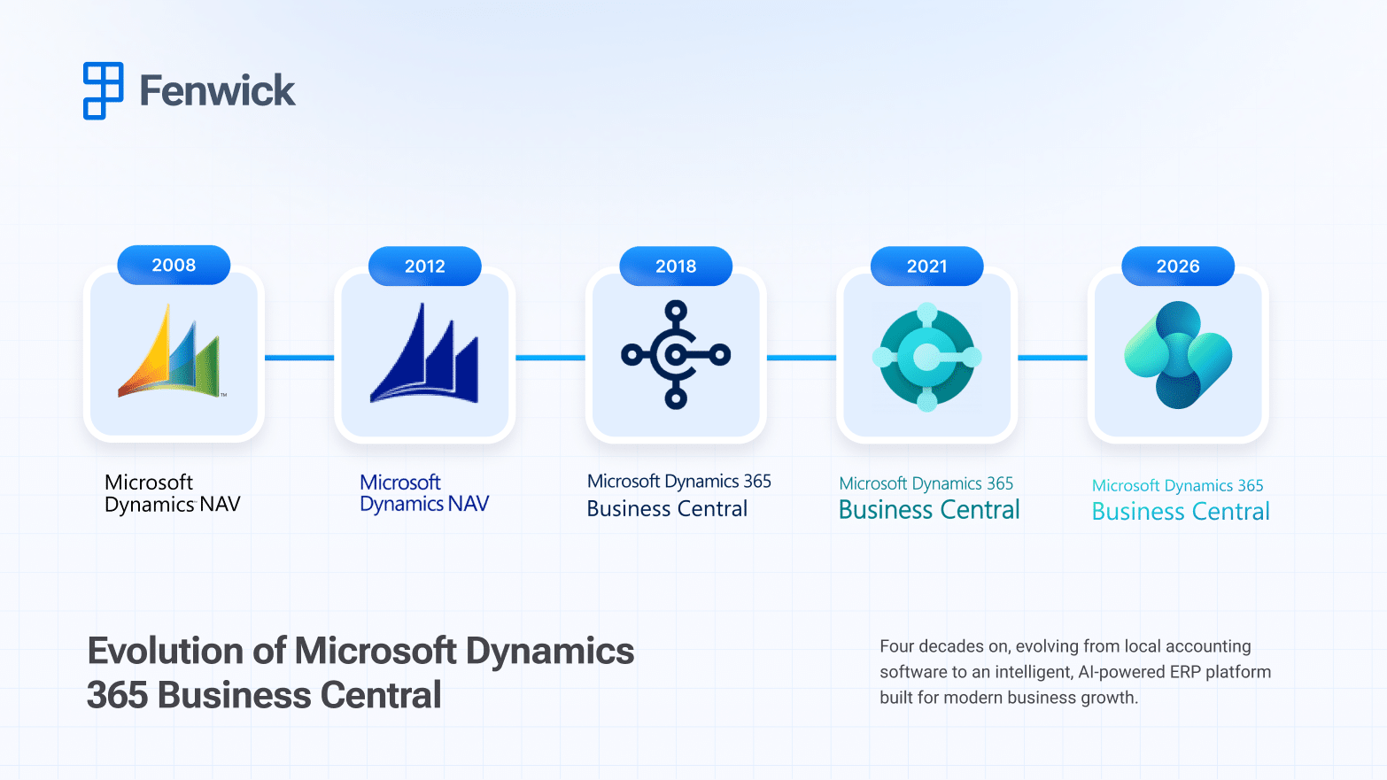
The early years: Navision and the Navigator identity
The product’s origins date back to 1984 in Denmark, where a small team set out to build accounting software for the growing personal computer market. In 1989, the solution was renamed Navision. During these early years, the branding was straightforward and functional, in line with the product’s focus on reliable financial management for small and mid-sized businesses.
The early Navigator-inspired icon drew on directional themes, reflecting the idea of helping businesses stay on course financially. As Navision expanded throughout Europe in the 1990s and entered new international markets, the branding evolved gradually. The icon became more refined, reflecting a system that had developed from a single-user accounting program into a multi-user ERP solution supported by an expanding partner network.
2002-2017: Microsoft Dynamics NAV and enterprise alignment


Microsoft acquired Navision in 2002, which led to the product becoming part of the Microsoft portfolio. It was later renamed Microsoft Dynamics NAV, aligning it with the wider Dynamics range of business applications.
During this time, the software itself continued to evolve. Towards 2017 it became more accessible through the browser, more closely integrated with Office 365, and progressively prepared for cloud deployment. Despite these changes, the visual identity remained steady and understated, supporting its role as a dependable on-premises ERP solution for small and mid-sized businesses.
2018: The shift to Business Central and a cloud-first identity

In 2018, Microsoft launched Microsoft Dynamics 365 Business Central. The change went beyond a new name. It marked the move to a cloud-based SaaS model built on Microsoft Azure.
The visual identity was updated at the same time. The icon adopted the modern Dynamics 365 design style, with softer shapes and layered elements. Rather than traditional ERP imagery, the new icon reflected connection and integration, aligning with the product’s broader role within Microsoft’s business applications.
This shift in branding coincided with several practical changes to the software. Business Central moved to a web-based interface, adopted subscription licensing, introduced ongoing updates, and implemented a new extension model. It also became part of the wider Dynamics 365 suite.
Overall, the updated icon reflected the product’s transition from a standalone accounting system to a cloud platform designed to work alongside other Microsoft applications.
2021: Expansion, platform integration and intelligent capabilities

As Business Central became available in more countries and localisations, its integration with Microsoft 365, the Power Platform, Azure services, and Dataverse continued to deepen.
The icon itself did not change significantly during this period, but it was increasingly presented alongside other Dynamics 365 applications. This positioning reflected Business Central’s role within a wider set of connected business tools.
The design remained consistent with Microsoft’s broader visual style, using gradients and rounded forms common across its applications. The overall look supported the product’s position as a cloud ERP platform designed to scale and adapt to different business requirements.
2026: A new visual identity for the AI era

The latest 2026 icon update introduces a softer, more dimensional design that aligns with Microsoft’s increasing focus on AI across its business applications. The refreshed identity reflects the direction Business Central is taking as AI capabilities become more embedded in the product.
This includes features such as Copilot support, AI-assisted reporting and forecasting, natural language prompts, and automated agents designed to support routine processes. These developments represent a gradual shift in how users interact with the system.
The updated icon moves away from sharper, more structured forms and adopts a smoother, more fluid appearance. This change reflects the product’s ongoing development, as it expands beyond traditional transaction processing to include more predictive and assistive functionality.
At the same time, the design remains consistent with Microsoft’s broader application branding. The new Business Central icon sits comfortably within the wider Microsoft ecosystem, reinforcing its place as part of an integrated set of cloud-based business tools.
An icon that mirrors the product journey
Looking back across four decades, the evolution of the Business Central icon tells a clear story:
- Early Navision branding focused on navigation and financial control.
- Dynamics NAV identity aligned the product more closely with Microsoft’s enterprise portfolio.
- The 2018 move to Business Central reflected its transition to the cloud and its place within the wider Dynamics 365 suite.
- The latest update aligns with the introduction of AI-driven capabilities and more automated functionality.
Each redesign coincided with a meaningful technological shift. The visual changes were never cosmetic alone. The branding evolved as the software expanded in scope and capability.
As Business Central continues to evolve, we can expect the branding to evolve with it. Each new visual identity signals more than just a design refresh, but a new stage in how businesses will manage, analyse, and act on their data.