A logo is more than a visual identifier, it’s a reflection of a company’s values, ambitions, and evolution over time. As Fenwick celebrates 50 years in business, its logos provide a visual timeline of the organisation’s growth; from a technical software consultancy focused on delivering reliable solutions, to a modern technology company building products, platforms, and ecosystems for the future.
While design trends have undoubtedly influenced each iteration, the evolution of the brand reveals something deeper: the transformation of Fenwick itself.
A Brand That Grew Alongside the Business
Across five decades, Fenwick has evolved from a specialist software provider into a trusted technology partner working within global ecosystems such as Microsoft. As the business expanded, so too did the role of the brand.
The logo journey can be viewed as a progression through three distinct phases:
Technical credibility → Structured growth → Modern, product-led maturity
What began as a practical, engineering-focused identity gradually became a more confident corporate brand before evolving into the flexible, digital-first identity used today.
1976 The Early Years: Building Trust Through Capability
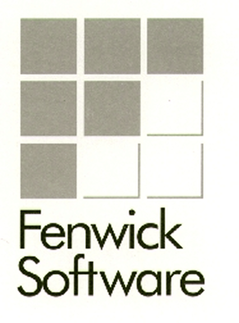
The earliest Fenwick logo reflected the priorities of the time. It was a functional mark designed for a company focused on technical excellence, reliability, and software craftsmanship.
Visually, the logo embraced many of the design conventions common to technology businesses of the era. Grid-based structures, simplified forms, and muted colour palettes communicated logic and precision rather than emotion. It was a brand designed to be understood. The nine-squared F was a logo that endured, creating the start of using a styled “F” made from the grey squares that would continue on in future iterations.
This approach aligned closely with Fenwick’s business focus during its formative years. Success was built on capability, delivery, and trust. The quality of the software and services mattered far more than marketing sophistication.
The logo carried a distinctly engineering-first character. Dense layouts, geometric structures, and practical typography suggested a company committed to solving complex problems through systems thinking and technical expertise.
2000 A Growing Business Requires a Stronger Brand
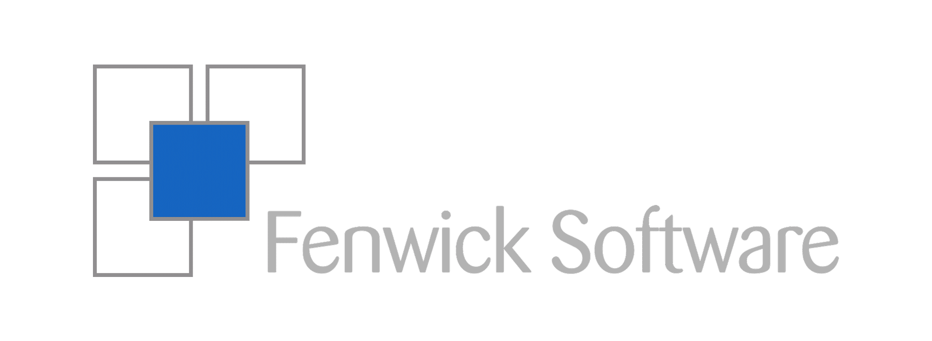
As Fenwick entered the 2000s and continued to grow, the brand evolved alongside the business.
The mid-era logo introduced greater structure, stronger visual hierarchy, and a more professional corporate appearance. The use of enterprise blue helped communicate trust, credibility, and maturity, while geometric framing created a sense of confidence and stability whilst still maintaining a stylised “F” within the icon. This was no longer the identity of a specialist boutique consultancy. It was the identity of an established organisation serving a growing customer base and building long-term partnerships.
Design trends of the period also influenced the logo’s direction. Marks were increasingly expected to perform across print collateral, office signage, presentations, and marketing materials. Consistency and recognisability became more important.
The logo’s central square motif became a prominent visual anchor, representing reliability and control. Its stronger horizontal composition improved readability and reinforced the company’s increasingly professional presence.
Most importantly, this version represented a shift in business positioning. Fenwick was evolving from an expert software provider into an established enterprise technology partner.
2022 The Modern Era: A Brand Built for Digital Ecosystems
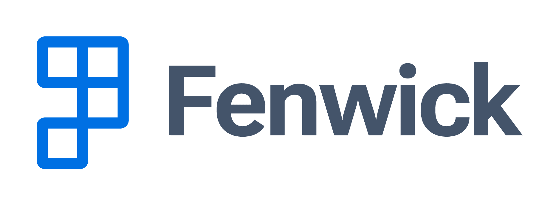
In 2022, Fenwick unveiled its current identity, marking the next chapter in the company’s evolution.
The new logo reflects a business that has moved beyond simply developing systems. Today, Fenwick develops products, solutions, and ecosystems that help organisations solve operational challenges at scale.
The modern logo embraces minimalist principles while retaining a strong connection to the company’s heritage. At its centre is an “F” constructed from negative space, where the blocks represent the concept of multiple systems/apps coming together to create one, unified system. While contemporary in appearance, the design intentionally preserves the square motif that has appeared throughout previous logo iterations, creating continuity between past and present.
The result is a logo that feels modern without abandoning its roots.
Unlike earlier versions, the current identity has been designed specifically for digital environments. It scales effortlessly from mobile app icons and favicons through to conference signage, software interfaces, social media content, and motion graphics.
It reflects a business operating in an increasingly connected world where technology platforms, integrations, and user experiences span countless digital touchpoints.
The logo no longer communicates simply that Fenwick builds software. It communicates that Fenwick helps organisations build connected ecosystems.
Jake Edwards was heavily involved in the logo creation, and when asked his thoughts:
Our logo continues to evolve alongside the company and the technology it creates. The redesign has proven its versatility, continues to resonate with our team, and reflects our focus on bringing solutions together to form a cohesive business system. And, for those familiar with classic 7-segment displays, you may even spot a bonus 5 and 0.
– Jake Edwards, Fenwick Tech Lead
What Changed Over Time?
While each version of the logo looks distinctly different, several themes have remained constant throughout the journey.
Simplification and Refinement
Over time, visual complexity has been progressively reduced. Earlier logos relied on literal structures and multiple graphic elements to communicate meaning. The current identity achieves more with less, using fewer shapes and cleaner forms while conveying stronger ideas.
This shift mirrors broader design trends but also reflects growing confidence in the brand itself.
A Shift in Positioning
The evolution of the logo also mirrors Fenwick’s transformation as a business.
The earlier identities represented a software consultancy delivering technical expertise. Today’s identity represents a technology company with a broader mission: delivering integrated solutions, products, services, and innovation across multiple platforms.
The removal of descriptors such as “Software” reinforces this evolution. The Fenwick name now has enough brand equity to stand on its own.
Digital-First Thinking
Perhaps the most significant change is the move from print-first design to digital-first design.
Modern brands must perform consistently across websites, mobile applications, dashboards, online communities, and emerging digital experiences.
The current logo was purpose-built for this environment. Its modular construction allows it to function as both a complete wordmark and a standalone icon, providing flexibility across products, sub-brands, and digital platforms.
A Closer Look at the Current Logo
The current Fenwick logo is built around a simple but powerful concept: systems working together.
The modular square elements represent software components, applications, and connected technologies that combine to create larger outcomes. Together they form a stylised “F”, reinforcing ownership while remaining abstract enough to represent growth and adaptability.
Each design decision contributes to the story:
- Squares communicate stability, logic, structure, and reliability.
- Blue reinforces trust, intelligence, and enterprise credibility.
- Negative space conveys confidence, clarity, and simplicity.
- Modular geometry reflects modern software architecture and composable technology platforms.
The logo also aligns naturally with the digital environments in which Fenwick operates today. Its clean geometry and layered structure complement the modern design systems used across Microsoft’s ecosystem, while remaining distinctive and recognisably Fenwick.
Celebrating 50 Years of Progress
Looking back across five decades, the evolution of the Fenwick logo is about far more than changing design styles.
It is a visual record of a company that has continually adapted, innovated, and grown. From a technical software specialist focused on delivering reliable solutions, to a modern technology organisation building products and ecosystems that power business transformation, the brand has evolved in step with the business itself.
The logos may have changed, but the principles that underpin them have remained remarkably consistent: reliability, expertise, innovation, and a commitment to helping customers succeed.
As Fenwick enters its next chapter, the current logo stands as both a symbol of how far the company has come and a reflection of where it is headed.
After 50 years, the icon continues to evolve.